methodological centre for museums in nature
RESPONSIBLE FOR
ui & ux website
Client
school project
Year
2017/2018
TOOLS
paper, sketch app, invision, framer js, coggle.it
01 Start from
the bottom
In my opinion, every design process needs to have prepared „ a good ground“ from the beginning.
Internal brief always helps me to achieve such ground, as well as it answers various questions regarding specific project.
I found as important as internal brief, creating a timetable together with a work structure. I’ve used this system whilst redesigning the web for Methodological centre for museums in nature.
02 Find problems
& define goals
I analysed the whole project with internal brief. This process helped me do define the current problems of the web, and set the goals in form of results, which might have solved those exposed problems.
Whilst working on the brief, I also created the moadboard with successful and less successful reviews, which should be used as base for my further work.
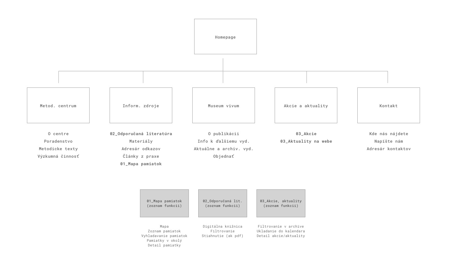
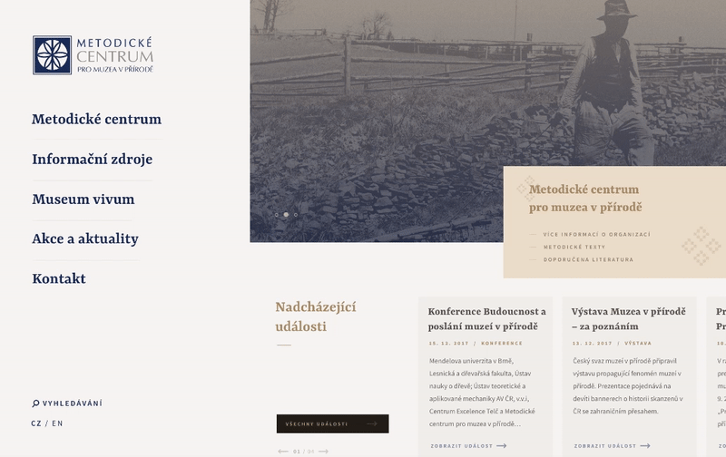
The wrong information architecture
The main problem was the structure of the content itself. Such content has a key role in webs like this one. Therefore, I needed to start with creation and restructuralisation of the architecture of the content.
Obsolete visual
& missing responsive design
I found the next problem in obsolete visual, which was not attractive to public, as well as there was absence of the responsive version of the web.
03 Wireframes
& prototyping
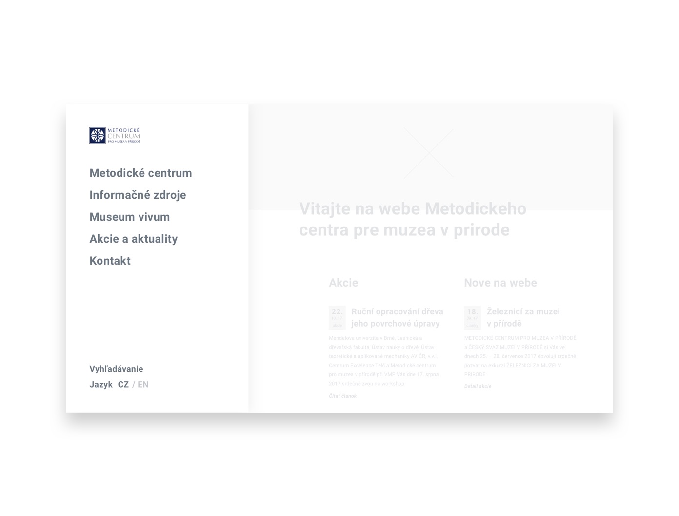
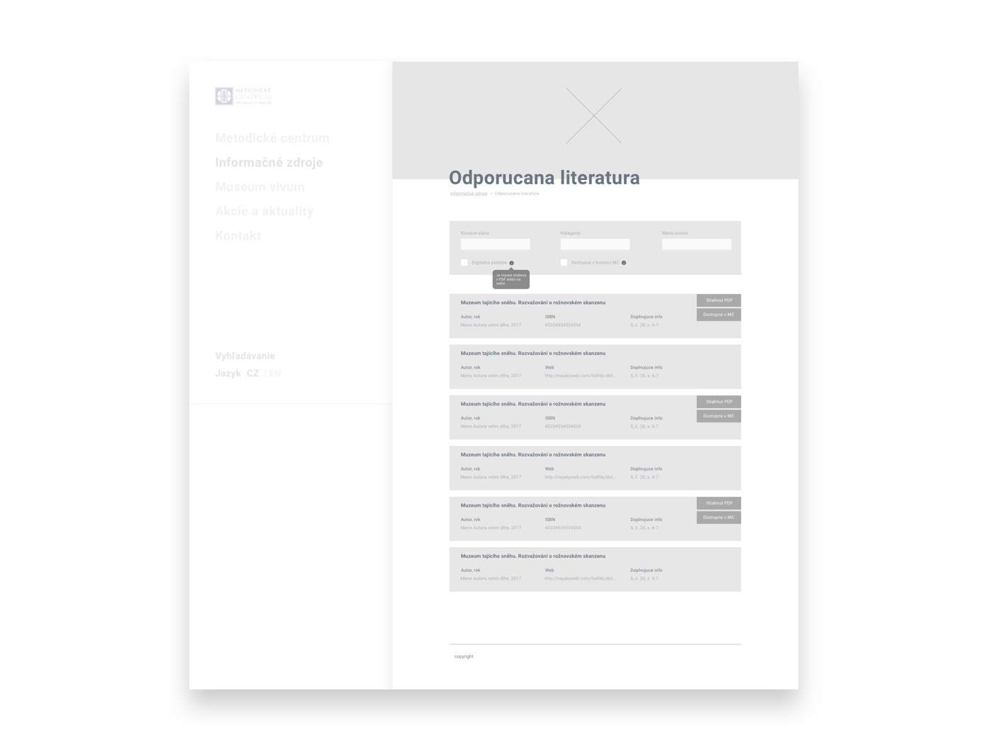
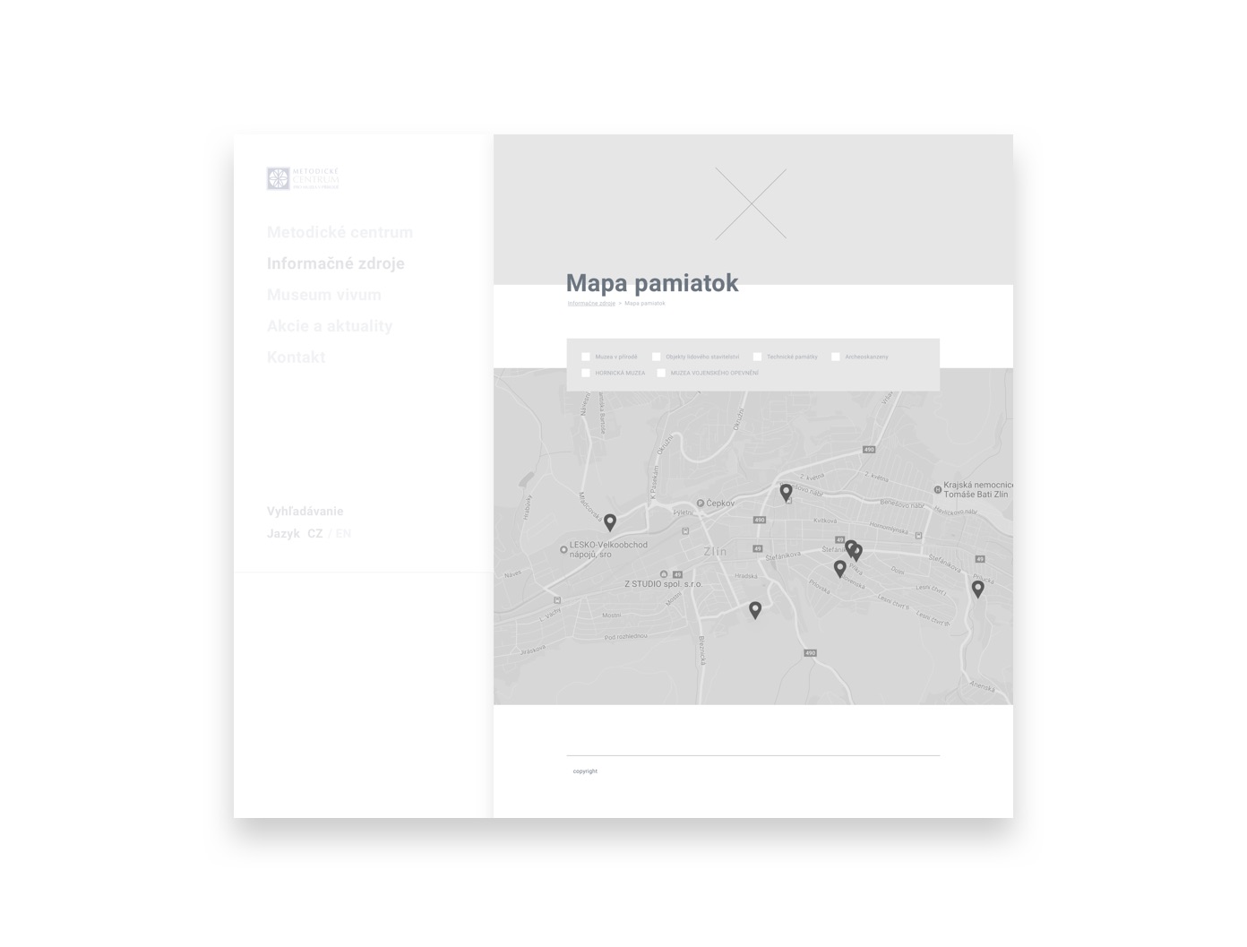
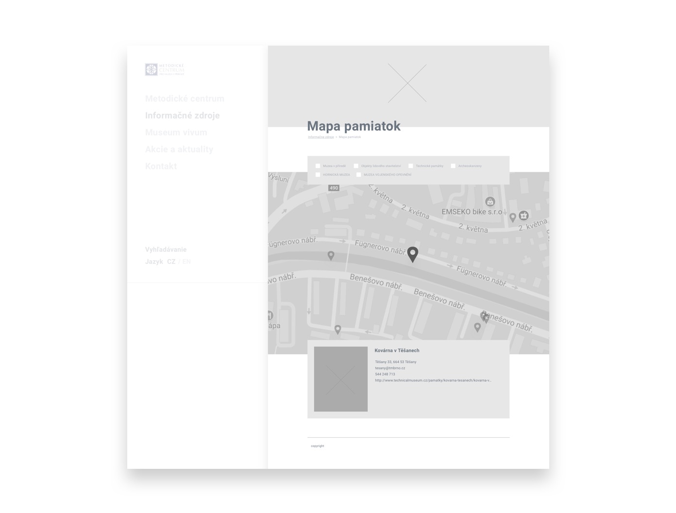
In the first phases, I worked on the sketches and „low fidelity“ wireframes, which were after subsequent clarification of the information structure elaborated into the detailed drafts.
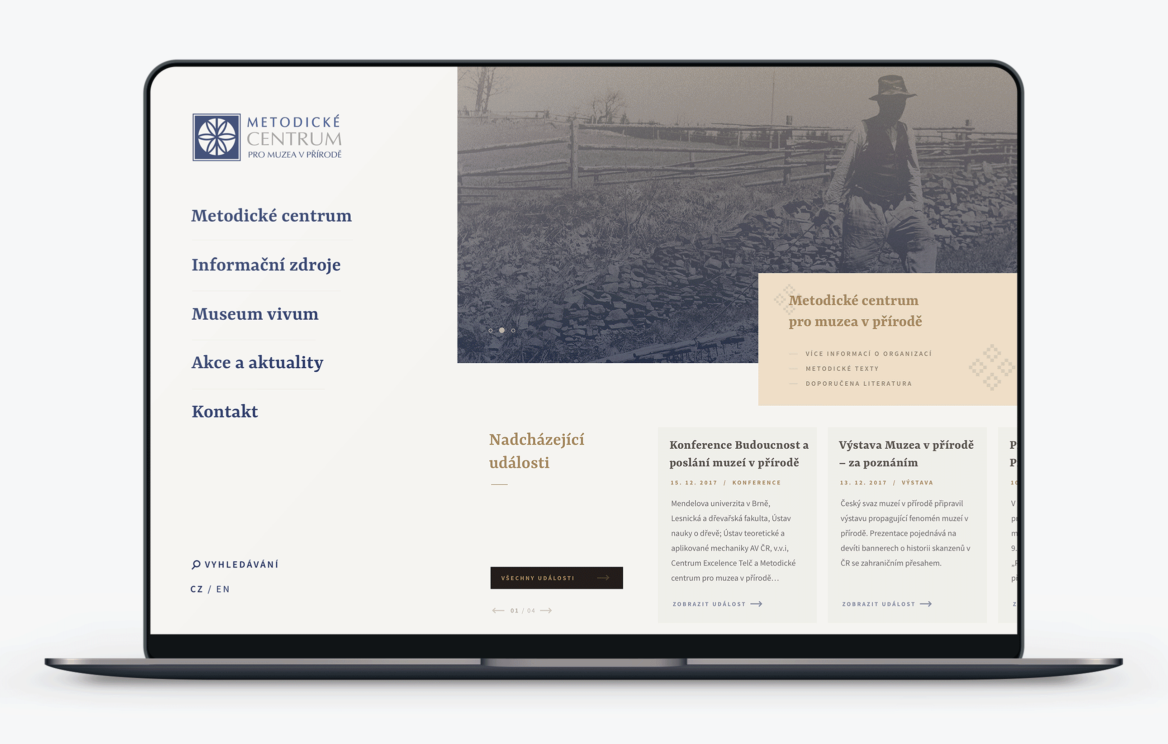
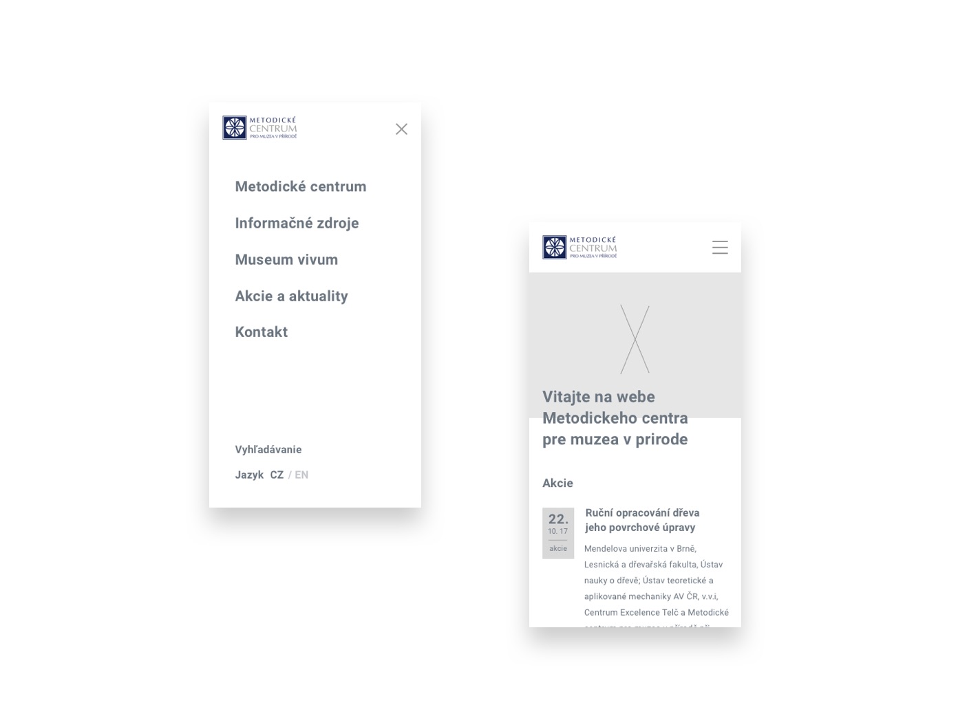
I came to the solution of dividing the content and navigation part into two blocks. This solution helps to filter the distortion.
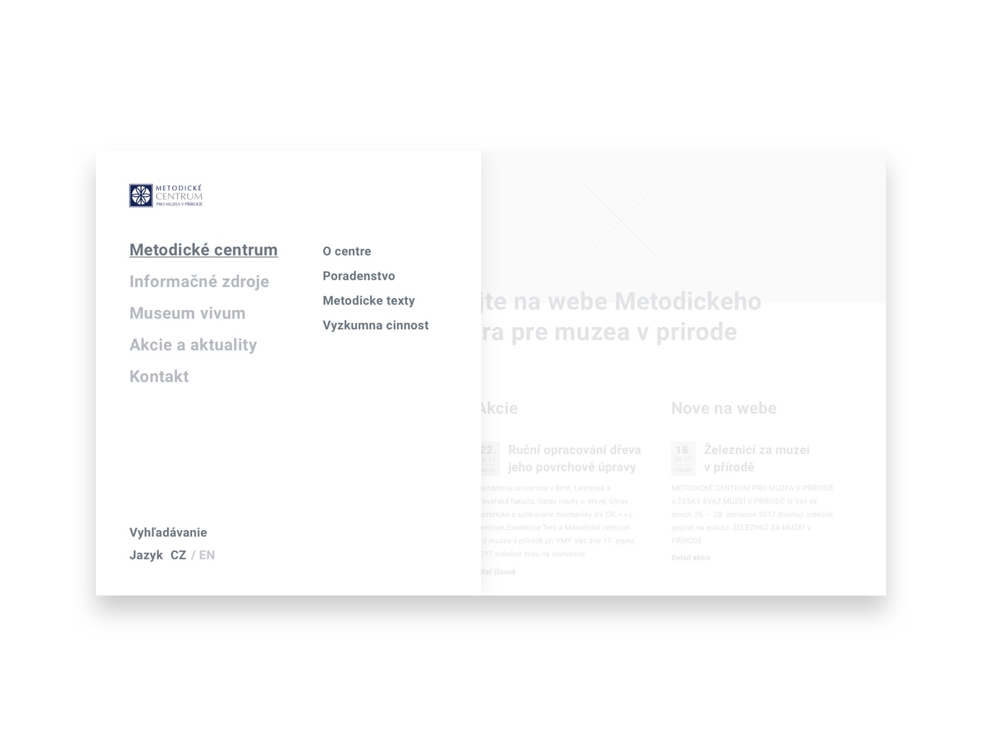
(gallery)
04 Interaction
principles
Dokonalosť produktu a jeho designu dotvárajú detaily. Tieto možno zanedbateľné detaily však dotvárajú v uživateľovi pocit kontroly nad produktom a pocit, že vie čo sa pri danej interakcii deje respektíve stane. V oblasti digitálneho designu hovoríme o takzvaných mikro–interakciách.
Jednou z mojich priorít bolo zlepšiť použiteľnosť a orientáciu v navigácii webu.
Riešenie som postavil na rozdelení obsahovej a navigačnej časti webu a pomocou interakcie pomôcť odfiltrovať rušivosť a zamerať sa na podstatu daného bloku.
Riešenie bolo testovane v rámci ateliernych konzultácií a bolo by vhodné ho odtestovať reálnymi uživateľmi.
Framer prototype – (link)
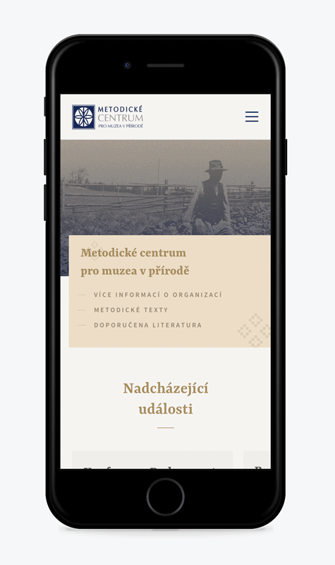
05 Responsive
design
Jedným z problémov, ktoré som zmieňoval na začiatku bola chýbajúca mobilná verzia webu.
V dobe keď už približne každý 4 človek pristupuje na náš web z mobilného zariadenia, je potrebné myslieť aj na tento fakt a snažil som sa to zohladniť aj v mojom riešení.